| Author |
Armour readout. |
BackSlash
Marshal
Galactic Navy

Joined: March 23, 2003
Posts: 11183
From: Bristol, England
|  Posted: 2006-02-18 18:39 Posted: 2006-02-18 18:39
The armour readout is a little... Hard to read.
Currently, we have two modes.
We have the armour component % readouts themselves, and we have the visual aid around the ship.
Two problems with this...
The components aren't organized in anyway, so trying to find out which is which arc, is rather hard. I have to right click through them all to find out which is which, and that can take time, which I don't really have, and if I've just killed an enemy, I need to use the mouse for other things.
Also, the visual aid isn't exactly acurate... It doesn't seem to recognize that there are TWO plates or more on an arc, and just treats it as a whole. So I have no idea if I've got a 0% and 15% or a 0% and 50%, or any other combination. All I have is a rough guess that my armour is either high, medium, or low. I can't calculate if I've got one, or two more alpha's left on that arc, and it produces a problem to those of us who use stats to allow us to exercise our combat skill to the full. Not to mention that usually the armour can flick from one colour to another in a few seconds.
So, we need a new visual aid. The rings are a tad old, and I think something new could help spice up the game for a few people (make it look perdy and all). I don't know how long such a thing would take, as I'm no graphics implimention expert.
What I was thinking about is a new ring system. It's easier if I explain with an example. Say 100% = 10 rings. So my EAD has ten rings on it's rear armour. When my armour starts taking damage, the first ring slowly fades untill I have 90% armour. Then, the next one would fade, untill 80%, and so on. There's also an alternative to rings, where a circluar bar could be used, that could slowly un-fill as the armour takes damage. This would be a lot more clear and easier visual aid to the current rings (gives the pilot a clear indication of how much he has left out of his armour).
Another easier approach could be to have a mouse over, where the UI would display the following upon hovering your mouse over your armour for a second.
ARMOUR #1 100% (inner rings)
ARMOUR #2 54% (middle rings)
SHIELD #1 0% (outer rings)
The above would be displayed for a further second before fading. This idea would allow people to move their mouse over the screen without it popping up everytime their mouse passes over their ship (due to the one second mouse over needed), and it also displays for a further second, allowing the user to briefly pause their mouse for a second, and then move it to whatever they need to use it for, whilst still having it displayed long enough for them to read. Ofcourse, this would be hovered over each arc (so you'd have a list over the AFT, LEFT, RIGHT, and FORE).
- Jack
[ This Message was edited by: BackSlash *Jack* on 2006-02-18 18:45 ]
_________________

|
Malorn
1st Rear Admiral
Joined: December 11, 2003
Posts: 42
From: USA Eastern Time
| Posted: 2006-02-18 22:58
I like the idea, but ten rings? That could stack up a bit, a station with a couple dreads and you wouldn't be able to see a thing 'cept pretty green rings.
Maybe a slightly less ring intensive approach would be better? I rather like the idea of the outer ring or rings standing for shields, and the inner rings for armor. Through I haven't had that much of problem with telling my status, perhaps because I haven't used dreads since two builds ago. I understand they have more armor slots now.
_________________
There are things in this world that man was not meant to know . . . and we have most of them convieniently arranged alphabetically by title.
|
Drafell
Grand Admiral
Mythica
Joined: May 30, 2003
Posts: 2449
From: United Kingdom
| Posted: 2006-02-19 01:47
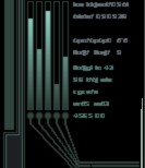
How about something that would show up like this, only drawn a lot better?

Those are three representations of what the rings would look like, one at near max, one at medium and one at fairly heavy dmg.
[ This Message was edited by: Drafell on 2006-02-19 01:48 ]
_________________
It's gone now, no longer here...Yet still I see, and still I fear.rnrn
rnrn
DarkSpace Developer - Retired

|
BackSlash
Marshal
Galactic Navy
Joined: March 23, 2003
Posts: 11183
From: Bristol, England
| Posted: 2006-02-19 05:37
@Malorn, I was only giving an example count.
@Drafell, some ships have three layers of defence making the "|" kinda useless for that third ring of defence.
_________________
|
Drafell
Grand Admiral
Mythica
Joined: May 30, 2003
Posts: 2449
From: United Kingdom
| Posted: 2006-02-19 10:25
The |'s would show the HP on that facing in amore accurate visual representation. They are not meant to represent individual facings, but a cumulative total.
Looking at it directly from the front, it would look similar to this:-
||||||||||||||||||||||||||||||||||||||||||| = 100%
|||||||||||||______|______|||||||||||| = 50%
|||||||||_________|_________||||||||| = 30%
||||||___________|___________|||||| = 15%
etc.
Of course, this is not a solution in the case of having different armors on the same facing. but it does give sligihtly better idea of how it is holding out. Although.. in the case of multiple facings, the display could be further subdivided like so:
. Inner . . . Outer . . . Outer . . . Inner .
|||||||||||||||||||||||||||||||||||||||||||||
[ This Message was edited by: Drafell on 2006-02-19 10:41 ]
_________________
It's gone now, no longer here...Yet still I see, and still I fear.rnrn
rnrn
DarkSpace Developer - Retired
|
Fattierob
Vice Admiral
Joined: April 25, 2003
Posts: 4059
| Posted: 2006-02-19 13:03
I like how that looks draffy, but it seems a bit ...cloggy.
I dunno, I think maybe armor rings should be color coded AND have a bar.
as in, as the health of the armor decreases, the rings themselves disappear. or get more alpha.
_________________
|
Enterprise
Chief Marshal
Joined: May 19, 2002
Posts: 2576
From: Hawthorne, Nevada
| Posted: 2006-02-20 04:54
Healthbars.
Not kidding here either.
RPGs use them. RTS uses them. Even EvE uses them.
Darkspace should.
Say for instance,
A bar for hull, red. A bar for shields, blue. A bar for armor, gray.
This bar of armor would be divided first into the four quadrants of your arcs, perhaps even graphically represented as such. This is -only- visable to you.
To enemys, they see the total hull, armor, shields when their mouse goes over your diamond or they click on your diamond.
In each quadrant, it is again divided into the number of armor gadgets you carry.
So for that specific arc, say you have two armor gadgets, you would see it divided in two, the top bar being the outermost bar, the lower the inner most.
So you know which is damaged, and at what level of damage it is at.
Of course it might be a bit cluttered..so...think on it.
Other than this, drafells idea sounded best.
-Ent
_________________
|
Drafell
Grand Admiral
Mythica
Joined: May 30, 2003
Posts: 2449
From: United Kingdom
| Posted: 2006-02-20 05:45
The other option, of course, is to have a separate display elsewhere on screen with healthbars - as suggested by Ent. But I am trying to think of a way this could be implemented into the existing ship displays as a form of overlay, without overly cluttering the screen space.
A better suggesdtion would probably be like this:-

It would so a solid color representation from bright green to bright red, without the fading used on the outer ring display, and have it as another toggle option that you can scroll to vie the / key.
**EDIT**
LET THIS DAY BE KNOWN TO ALL AS THE DAY THAT DRAFELL BECAME THE 1337 FORUM [deleted]!!!!!!!

[ This Message was edited by: Drafell {r33} on 2006-02-20 06:31 ]
_________________
It's gone now, no longer here...Yet still I see, and still I fear.rnrn
rnrn
DarkSpace Developer - Retired
|
Enterprise
Chief Marshal
Joined: May 19, 2002
Posts: 2576
From: Hawthorne, Nevada
| Posted: 2006-02-20 06:58
Bloody brilliant Drafell.
Looks perfect to me. =)
-Ent
_________________
|
BackSlash
Marshal
Galactic Navy
Joined: March 23, 2003
Posts: 11183
From: Bristol, England
| Posted: 2006-02-20 07:04
Looks nice!
But may I make a suggestion that different colours be used  . Being colour blind sucks, and it's hard to determin the inbetween (since when the colour gets to a certain stage, I can't really determin what it is, or if it's changing... Hard to explain). If the colour and the OSD could be done together, then that's great . . Being colour blind sucks, and it's hard to determin the inbetween (since when the colour gets to a certain stage, I can't really determin what it is, or if it's changing... Hard to explain). If the colour and the OSD could be done together, then that's great .
_________________
|
Mr Black
Grand Admiral
Palestar

Joined: September 20, 2003
Posts: 486
From: Gaifenland
| Posted: 2006-02-20 07:44
Quote:
|
On 2006-02-20 07:04, BackSlash *Jack* wrote:
Looks nice!
But may I make a suggestion that different colours be used . Being colour blind sucks, and it's hard to determin the inbetween (since when the colour gets to a certain stage, I can't really determin what it is, or if it's changing... Hard to explain). If the colour and the OSD could be done together, then that's great .
|
|
Thats why you have the floating % display on the arcs. Its supposed to be a feature of that idea.
_________________
 \\r\\n \\r\\n
DarkSpace Administrator - \\r\\n
drafell@palestar.com
|
Ants
Chief Marshal
Joined: February 11, 2005
Posts: 315
From: Canada
| Posted: 2006-02-20 08:06
How about they just take of some of the armour and leave it at 4 plates each... But the armour is an aspect to the amount of armour for the ship...
IE... If it is on a UGTO curser and there is to be 2 plates on aft and side mounts it shows up as one aswell as it will be twice as strong as just one plate and rated for the curser hull.. then the front of say the TC has one plate for all three of the froe armour... This way you can keep the status where it is without having to add extra graphics to the game or having to do more to get your armour stats... (in combat i dont want to be grabbing my mouse to get stat). also all armour/sheild plates will also show up in the same spot at all times....
_________________
|
)