| Author |
GUI and stuff.. |
Pope
Fleet Admiral
Joined: June 11, 2002
Posts: 2449
From: World of tomorrow
|  Posted: 2004-10-05 17:08 Posted: 2004-10-05 17:08
First of all, GUI..
A context sensitive Interface is the shiznit.. In a game like this, it is mandatory. For example, try watching a Newbie trying to change his Ship. Get what i mean?
Here is my initial suggestion..
Have an extra Panel, dynamically resizing, toggleable via a free F-Key initially to the right side, with the following Buttons, corresponding to the relevant Functions also reachable via Keyboard commands or on-click popup Buttons at the Target view.
- Enter Shipyard, displayed when in range of a Shipyard.
Err, and there comes the writers block..
Maybe not such a good idea after all if i can't even think of more than one function that would be viable to put there.. Maybe someone else can think of more?
In any case, i think re-entering a Shipyard should be made considerably more intuitive.. err..
sono out.. 
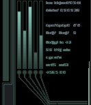
On a totally different subject, I took this nice little screenshot that was produced due to some really obscure bug, but it lit up one of my older ideas again..
I think we should have recently lost contacts REMAIN on the Navigational display for at least a minute or 2, not targettable and displayed in, for example, yellow. 

_________________

|
Avernus
Vice Admiral
Joined: September 12, 2004
Posts: 81
| Posted: 2004-10-05 17:57
Darkspace IMO is fine. You just need to learn to read. All the buttons on the current GUI explain how to do stuff if you just take the time to read. Some people are a little slower to catch on and others pick it up instantly. It's not that complicated at all really. There are a few rough edges that leave you asking yourself questions but the shipyard in my opinion isn't one of them. Learning how to dock ships and move them around is more important than learning how to hit control + y then < or > and then control + u. The simplicity of the current system is what makes it great IMO.
[ This Message was edited by: Fatal Avernus on 2004-10-05 17:57 ]
_________________
|
Dwarden
Admiral
CHIMERA
Joined: June 07, 2001
Posts: 1072
From: Czech Republic
| Posted: 2004-10-05 18:29
actually the GUI and solutions can be much better ...
once there was for example much nicer system for targeting arrows and rectangles , for yet uknown reasons it was taken away ...
there exist many ways how improve DS and GUI is on one of them ...
_________________
... Ideas? ... that's Ocean w/o borders !
|
Avernus
Vice Admiral
Joined: September 12, 2004
Posts: 81
| Posted: 2004-10-05 18:34
Yeah there is always room for improvement but at this point all it needs is some advanced filters and possibly a touch up on target indicators right? I like this game for many reasons. It runs fast and efficiently for the most part. Not having some big fancy GUI is one reason it performs so well.
_________________
|
)