| Author |
Redux: ICC Dread concept |
Kenny_Naboo
Marshal
Pitch Black

Joined: January 11, 2010
Posts: 3823
From: LobsterTown
|  Posted: 2011-08-04 14:39 Posted: 2011-08-04 14:39
Edit:
Update: I've redesigned the entire dread from the nose. (The only part I retained).
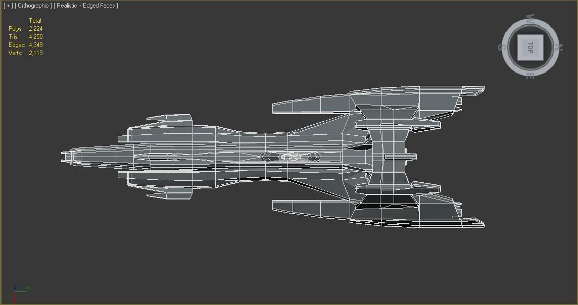
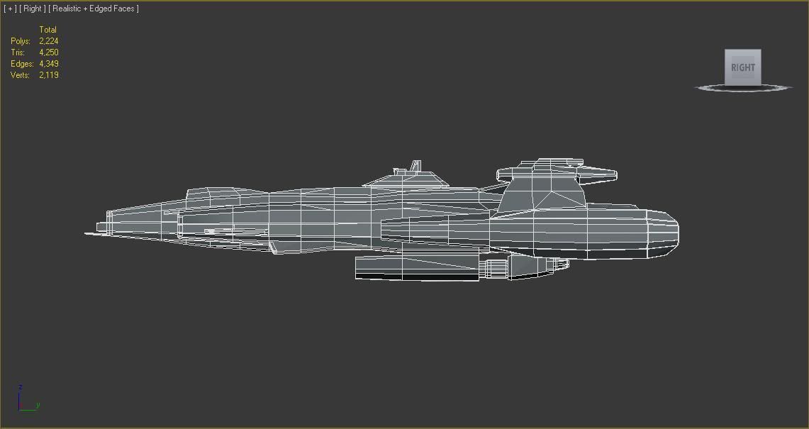
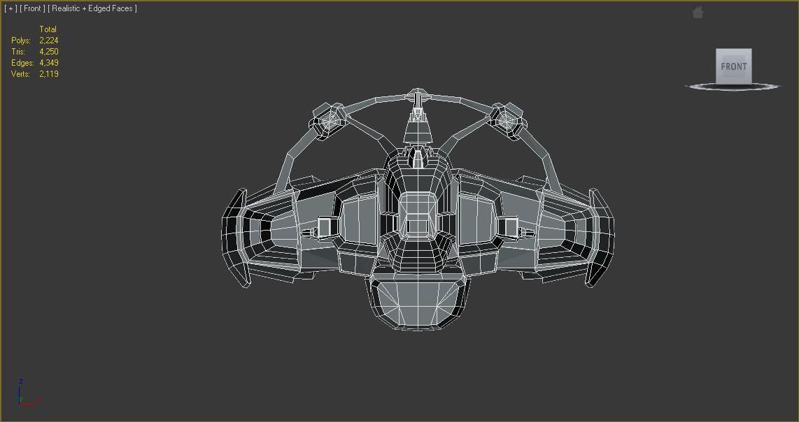
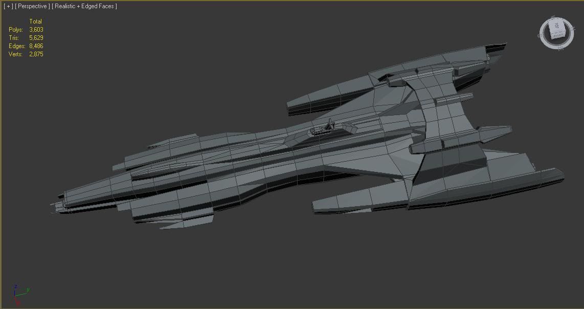
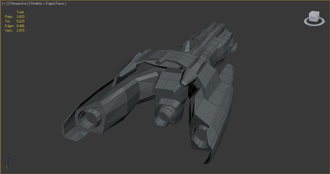
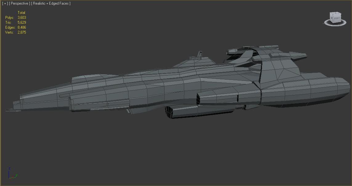
[ This Message was edited by: Kenny_Naboo[+R] on 2011-09-07 11:00 ]
_________________
... in space, no one can hear you scream.....

|
Xavier I. Agamemnon
Grand Admiral
Exathra Alliance Fleet

Joined: October 12, 2010
Posts: 357
From: Babylon5
|  Posted: 2011-08-04 14:59 Posted: 2011-08-04 14:59
what would this replace. it looks liike there are fighter bays on this. and would look go as a carrier dread or a command. but not a CD SD or AD. but thats my opinoin.
_________________

Xavier I. Agamemnon
CD/I.C.S Spartacus
HC/I.C.S Athena
CDD/I.C.S Achilles
Leader of the Exathra Alliance Fleet.


|
Brutality
Marshal
Joined: May 25, 2009
Posts: 659
From: Alaska, USA
|  Posted: 2011-08-04 15:01 Posted: 2011-08-04 15:01
hmm looks amazing, trying to imagine it textured  . Good work kenny . Good work kenny
_________________

|
Bardiche
Chief Marshal
Joined: November 16, 2006
Posts: 1247
|  Posted: 2011-08-04 15:01 Posted: 2011-08-04 15:01
I think it could use some bows to avoid looking too flat. Everyone knows we hate flat.
_________________
|
Talien
Marshal
Templar Knights

Joined: May 11, 2010
Posts: 2044
From: Michigan
|  Posted: 2011-08-04 16:10 Posted: 2011-08-04 16:10
Would make a good Command Carrier model.
_________________
Adapt or die.
|
Ravendark
Marshal
Sanity Assassins

Joined: July 01, 2010
Posts: 443
|  Posted: 2011-08-04 16:43 Posted: 2011-08-04 16:43
will kennys awsome 3d modeling work ever pay off and his amazing models ever replace anything? they should have already!!
_________________

|
Scorched Soul[+R]
Marshal
Pitch Black

Joined: November 14, 2005
Posts: 378
From: USA, NJ, Princeton
|  Posted: 2011-08-04 17:57 Posted: 2011-08-04 17:57
Definatly cool, I always thought of ICC ships being a little less symetrical, although this feeling might go away if it gets textured. ICC ships always seemed like they started as just a cockpit. compartments and facilities are then added upon the whims of the designer who then came back through and added support beams to make sure nothing falls off. On the other hand ugto ships gave the feeling that the hull class shape was designed first and then passed to another designer who put all the compartments and facilities inside and took a hammer to it until everything fits just enough that they can close the hatch and call it a day. Both methods have their merits but leave you with distinctly different impressions.
To shorten it ugto started with the outside of their jigsaw and filled it in while icc cut up all the pieces threw it on the board and scotch taped it all together, now would you like a picture or an impresionistic collage.
[ This Message was edited by: Scorched Soul[+R] on 2011-08-04 18:32 ]
_________________

![Email Scorched Soul[+R]](http://www1.palestar.com/gamecq/phpBB/images/email.gif)
|
Rebellion
Marshal
Faster than Light

Joined: June 20, 2009
Posts: 730
From: sol
|  Posted: 2011-08-04 18:41 Posted: 2011-08-04 18:41
Quote:
|
On 2011-08-04 17:57, Scorched Soul[+R] wrote:
Definatly cool, I always thought of ICC ships being a little less symetrical, although this feeling might go away if it gets textured. ICC ships always seemed like they started as just a cockpit. compartments and facilities are then added upon the whims of the designer who then came back through and added support beams to make sure nothing falls off. On the other hand ugto ships gave the feeling that the hull class shape was designed first and then passed to another designer who put all the compartments and facilities inside and took a hammer to it until everything fits just enough that they can close the hatch and call it a day. Both methods have their merits but leave you with distinctly different impressions.
To shorten it ugto started with the outside of their jigsaw and filled it in while icc cut up all the pieces threw it on the board and scotch taped it all together, now would you like a picture or an impresionistic collage.
[ This Message was edited by: Scorched Soul[+R] on 2011-08-04 18:32 ]
|
|
+1
and i think this would make a great Command dread replacement.
_________________

\"War does not decide who is right, but who is left\"
\"I stopped fighting my inner demons we're on the same side now\"
|
Kenny_Naboo
Marshal
Pitch Black

Joined: January 11, 2010
Posts: 3823
From: LobsterTown
|  Posted: 2011-08-04 19:14 Posted: 2011-08-04 19:14
Quote:
|
On 2011-08-04 15:01, Gesellschaft wrote:
I think it could use some bows to avoid looking too flat. Everyone knows we hate flat.
|
|
Yes. The thought did cross my mind.
What would u suggest?
You can always take the side and front profile and use MS Paint or something and do a rough paintover to add yr suggested detail in. The ship is still way below the poly budget for a dread.
Anyone?
_________________
... in space, no one can hear you scream.....

|
SpaceAdmiral
Grand Admiral
Joined: May 05, 2010
Posts: 1005
|  Posted: 2011-08-04 19:38 Posted: 2011-08-04 19:38
Seems more industrial and less curvy than other ICC ships.
_________________

|
µOmniVore
Grand Admiral
Joined: September 13, 2006
Posts: 171
|  Posted: 2011-08-04 19:40 Posted: 2011-08-04 19:40
Looks Great i would suggest some kinda cannon barrels in the front for the fixed mount ion cannons (unless ions are turreted) also that would make a great MD with the wings being missile tubs
_________________
When we fail to dream we fail as a society.


|
Scorched Soul[+R]
Marshal
Pitch Black

Joined: November 14, 2005
Posts: 378
From: USA, NJ, Princeton
|  Posted: 2011-08-04 19:56 Posted: 2011-08-04 19:56
Quote:
|
On 2011-08-04 19:14, Kenny_Naboo[+R] wrote:
Quote:
|
On 2011-08-04 15:01, Gesellschaft wrote:
I think it could use some bows to avoid looking too flat. Everyone knows we hate flat.
|
|
Yes. The thought did cross my mind.
What would u suggest?
You can always take the side and front profile and use MS Paint or something and do a rough paintover to add yr suggested detail in. The ship is still way below the poly budget for a dread.
Anyone?
|
|
I am not going to say that your wrong but in my opinion, which I'm still not sure I adequately explained(haha), instead of more bows I think it needs more random protusions/dishes/recievers. I'm not going to pretend I've ever modeled anything but I assume that comes in when you texture. Maybe icc ships have more curves than I realize and the random protusions just throw it off. In that case I would add slight curves to pieces that appear to be compartments while leaving structural support type pieces flat angular and very "rigid" looking.
Btw I also want to take a hammer and pop the exhaust cones till they are flush or almost with their housings.
I don't think I will ever be done editing this post but I also want to tear off the bridge looking structure turn it around 180 and then place it closer to the front on the under side of the ship as an obsevation deck deal. the reasoning that it is a space ship and there fore probably more worried about what is happening under it as upossed to above it. If you are coming into orbit and are looking out of the top of the ship and seeing the planet that would feel wrong. Its like fliping your sail boat donning scuba gear and trying to catch ocean currents in your sail. There is also less chance that someone will plow their A-Wing through your bridge.
[ This Message was edited by: Scorched Soul[+R] on 2011-08-04 20:46 ]
_________________

![Email Scorched Soul[+R]](http://www1.palestar.com/gamecq/phpBB/images/email.gif)
|
Veronw
Marshal
Joined: December 13, 2004
Posts: 554
|  Posted: 2011-08-04 20:22 Posted: 2011-08-04 20:22
Hmm. Too stargateish. Try grabbing me when you see me in lobby next time your on so I can give you the hyper detailed critique I've got swimming in my head, would hate to have to type out a three page crit on the forums 
_________________
|
Scorched Soul[+R]
Marshal
Pitch Black

Joined: November 14, 2005
Posts: 378
From: USA, NJ, Princeton
|  Posted: 2011-08-04 20:47 Posted: 2011-08-04 20:47
Quote:
|
On 2011-08-04 20:22, Veronw wrote:
Hmm. Too stargateish. Try grabbing me when you see me in lobby next time your on so I can give you the hyper detailed critique I've got swimming in my head, would hate to have to type out a three page crit on the forums 
|
|
Most of my posts go through multiple renditions if I tried in chat I would sound dumb.
_________________

![Email Scorched Soul[+R]](http://www1.palestar.com/gamecq/phpBB/images/email.gif)
|
Kenny_Naboo
Marshal
Pitch Black

Joined: January 11, 2010
Posts: 3823
From: LobsterTown
|  Posted: 2011-08-04 20:49 Posted: 2011-08-04 20:49
Quote:
|
On 2011-08-04 19:56, Scorched Soul[+R] wrote:
I am not going to say that your wrong but in my opinion, which I'm still not sure I adequately explained(haha), instead of more bows I think it needs more random protusions/dishes/recievers. I'm not going to pretend I've ever modeled anything but I assume that comes in when you texture. Maybe icc ships have more curves than I realize and the random protusions just throw it off. In that case I would add slight curves to pieces that appear to be compartments while leaving structural support type pieces flat angular and very "rigid" looking.
Btw I also want to take a hammer and pop the exhaust cones till they are flush or almost with their housings.
I don't think I will ever be done editing this post but I also want to tear off the bridge looking structure turn it around 180 and then place it closer to the front on the under side of the ship as an obsevation deck deal. the reasoning that it is a space ship and there fore probably more worried about what is happening under it as upossed to above it. If you are coming into orbit and are looking out of the top of the ship and seeing the planet that would feel wrong. Its like fliping your sail boat donning scuba gear and trying to catch ocean currents in your sail. There is also less chance that someone will plow their A-Wing through your bridge.
|
|
Good points. And noted too.
I also think that it needs more stuff on the ventral hull. More vertical action needed, huh?
Maybe a dome at the bottom? Or some stuff hanging out?
Thing is I wanna avoid having the GT-Wing  thingie on the current AD/CD models, or the Star Treky engine pods of the MD/CC. thingie on the current AD/CD models, or the Star Treky engine pods of the MD/CC.
But it ended up looking flat instead. Hmm....
Quote:
|
On 2011-08-04 20:22, Veronw wrote:
Hmm. Too stargateish. Try grabbing me when you see me in lobby next time your on so I can give you the hyper detailed critique I've got swimming in my head, would hate to have to type out a three page crit on the forums 
|
|
Interesting observation. I don't really pay attention to SG ships so I'm pretty sure I didn't draw any inspiration from there. If anything, I was afraid that it would be too BSG-ish.
OMG, I'm gonna get a 30 minute lecture by Veron!  
PM me your critique then. I rarely see you in the lobby when I'm online. 
BTW... Paintover!!
Keep all your ideas coming, ppl. We need more vertical structures on the ship.
[ This Message was edited by: Kenny_Naboo[+R] on 2011-08-04 21:16 ]
_________________
... in space, no one can hear you scream.....

|